Understanding Color: RGB vs. CMYK vs. Pantone for Printing
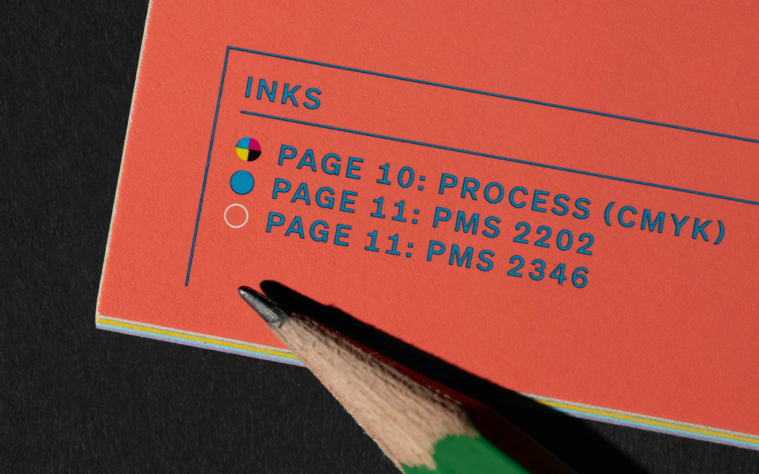
photo credit: The Office of Ordinary Things
At D&K Printing, we talk about color – a lot! It's fundamental to what we do, and understanding the different ways color is created and reproduced is key to getting the best results for your print projects. Today, let's dive into the fascinating world of RGB, CMYK, and Pantone inks.
RGB: The Colors of Light (For Screens.)
Think about how you see colors on your computer monitor, smartphone, or TV. These devices use RGB, which stands for Red, Green, and Blue. RGB is an "additive" color model, meaning that these three primary colors of light are added together in various intensities to create a vast spectrum of colors. When all three color are combined, they create white.
RGB has a very wide color gamut, meaning it can display a huge range of vibrant and luminous colors. This is why your digital designs often look so bright and rich on screen.
CMYK: The Colors of Pigment (For Print.)
Now, when it comes to putting ink on paper, we switch gears to CMYK. This stands for Cyan, Magenta, Yellow, and Black. CMYK is a "subtractive" color model. Instead of adding light, these inks subtract or absorb certain colors of light, reflecting the remaining colors back to our eyes. When all four inks are combined, they create black.
The CMYK color gamut is significantly smaller than RGB. This is a crucial point. The vibrant blues, greens, and oranges you see on your screen might not be perfectly reproducible with standard CMYK inks. This is why colors can sometimes look duller or different when printed compared to their on-screen appearance.
Why the Difference Matters for Printing
When you send us a design created in RGB, we need to convert it to CMYK for printing. During this conversion, some colors that are outside the CMYK gamut will be adjusted to the closest possible CMYK equivalent. This is known as "gamut mapping." While our experts at D&K Printing do everything to ensure the best possible conversion, understanding this difference upfront can help you design more effectively for print.
Pantone Inks: Achieving Perfect Spot Colors
What if you need a very specific, consistent color that absolutely has to match, like a brand logo color? That's where Pantone Matching System (PMS) inks come in. Pantone colors are "spot colors," meaning they are pre-mixed inks, each with a unique formula and number.
Have a project that seems impossible? Those are our favorites. Let’s talk about how we can bring your most complicated ideas to life.
Want to see more of our work? Check out our capabilities page or contact Tanner at tannerb@dkprinting.com for a quote on your next project.